Colour is more than just a visual element in design; it’s a powerful tool that can shape perceptions, guide user experiences, and enhance overall aesthetics. When used effectively, colour can transform a design from ordinary to exceptional. Let’s explore how to use colour to create compelling and impactful designs.
The Power of Colour in Design
Colour has a profound impact on how we perceive and interact with designs. It can influence emotions, signal actions, and establish a brand identity. Here are key considerations for using colour effectively in your design projects:
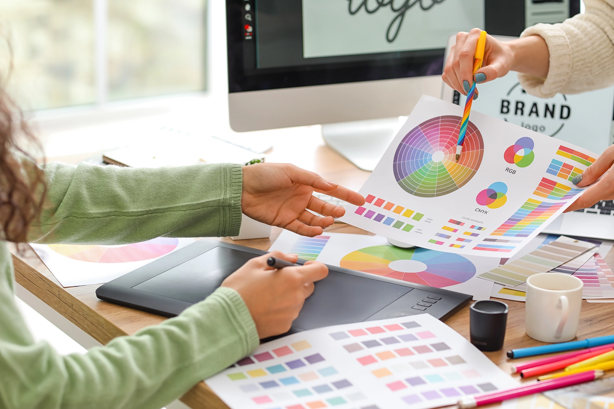
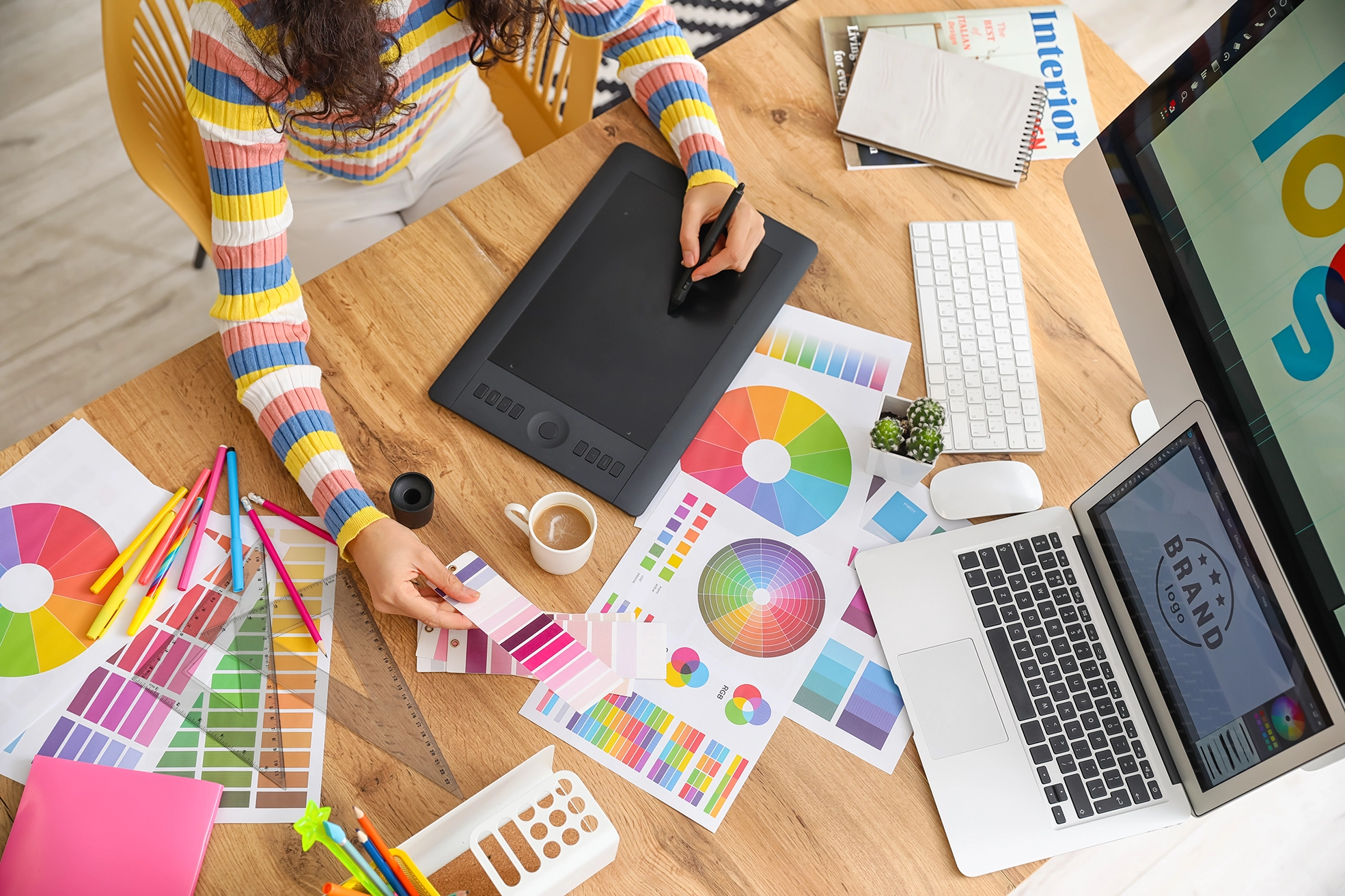
Understanding Colour Theory
Colour Wheel Basics: A colour wheel is a fundamental tool in design, consisting of primary, secondary, and tertiary colours. Understanding how these colours interact helps in creating harmonious colour schemes.
Colour Harmonies: Use colour schemes like complementary (opposite colours), analogous (adjacent colours), and triadic (three equally spaced colours) to create visually appealing designs.
Creating Emotional Impact
Emotional Associations: Colours can evoke specific emotions. For example, blue often conveys trust and calm, while red can signal excitement or urgency. Align your colour choices with the desired emotional response for your design.
Brand Identity: Consistent use of colour helps in building a strong brand identity. Choose colours that reflect your brand’s personality and values, and use them consistently across all design elements.
Establishing Visual Hierarchy
Focus and Attention: Use colour to direct users’ attention to key elements. For instance, using a bold colour for call-to-action buttons can make them stand out and encourage interaction.
Contrast and Readability: Ensure there is sufficient contrast between text and background colours to enhance readability. High contrast improves user experience and accessibility, making content easier to read for everyone.
Designing for Usability
Consistency: Maintain colour consistency throughout your design to avoid confusion. Consistent colour use helps users quickly learn what different colours signify and improves the overall coherence of your design.
Testing and Feedback: Test your colour choices in different environments and devices to ensure they work well across various conditions. Gather feedback from users to understand how colour affects their interaction with your design.
Incorporating Trends and Personal Style
Trends: Stay updated on colour trends to keep your designs fresh and relevant. However, balance trends with timeless design principles to create something that resonates long-term.
Personal Style: Infuse your unique style into your colour choices. While trends can inspire, ensure your colour palette reflects your or your brand’s identity and message.
Practical Tips for Effective Color Use
Create a Mood Board: Assemble a mood board with colours that inspire you. This helps in visualizing how different colours work together and finding the right palette for your project.
Use Tools: Utilize colour tools and generators to explore and test colour combinations. Tools like Adobe Color and Coolors can help you create harmonious palettes.
Consider Accessibility: Always keep accessibility in mind. Use colour contrast checkers to ensure your design is accessible to users with visual impairments.
Conclusion
Colour is a dynamic element that can greatly enhance the effectiveness of your design. By understanding colour theory, creating emotional impact, and establishing visual hierarchy, you can craft designs that are not only beautiful but also functional and user-friendly. Embrace colour as a strategic tool in your design toolkit to make your projects stand out and resonate with your audience.
