To continue to serve the growing population of the University Endowment Lands area around the University of British Columbia (UBC), the University Neighbourhoods Association (UNA) brought on the KIMBO team to design a new website to expand the association’s marketing and communications capacities. This includes the implementation of new functionalities to streamline the UNA’s operations moving forward, such as integration with the PerfectMind software for online booking. We worked closely with UNA to ensure that our creative direction aligned with the client’s vision for this project.
What We Delivered:
- Website Design & Development
- Responsive UI
- Seamless PerfectMind API integration
- Content Optimization & Migration
- Third-party APIs & plugin integrations
- Staff WordPress Training
Project Challenges
There were a few main goals to ensure the success of this project: the first being an overall improvement of design, functionality, and user-experience over the previous site so that it is in-line with modern web technologies. UNA had outgrown the off-the-shelf WordPress template it was using and instead committed to investing in a long-term solution to solve their problems. This meant a custom-built website from the ground up, implementing the requirements from a few different departments.
We prioritized the search functionality and wanted to show users better search results. Using a premium plugin with robust functionalities, search results are divided up into prominent categories on the site: News & Updates, Pages, and Events.
The second main goal being the tight integration of the PerfectMind membership/booking management system’s Application Programming Interface (API). As UNA aimed to create a seamless experience for when its members search for Recreational Programming offerings, our design for true integration went way beyond the stock iFrame embedding option offered by PerfectMind. This way, UNA’s Program information gets pulled directly from the PerfectMind API, and populates the site with all of our design and styling in a coherent manner.

The new website features an overall improvement of design, functionality, and user-experience over the previous design so that it is in-line with modern web technologies.
Project Strategy
To achieve the first goal, our team followed two core principles with the redesign of UNA’s website: intuitive and functional. In addition to improving the overall aesthetics of the website, we ensured that every change we made served a purpose in improving the user experience of the newly redesigned UNA website. Similar to many municipality government websites, we used the UNA’s brand colour of green extensively throughout the entire website to maintain a strong community presence with the UNA’s typical site visitors, those being the residents of the area. A site-wide Alert system was also built-in for timely news and updates distribution, an especially important feature to have through the 2020 COVID-19 pandemic. The website is responsive for use on both desktop and mobile devices.
Advanced Search results were integrated into the website to give the user more flexibility in their queries as compared to the standard WordPress search that comes with the CMS. This allows users to search for resources and webpages via different combinations of relevant keywords, providing a much more intuitive user experience. The ability to display real-time, user-based info on the front page for the Rec Centre hours was included to ensure that users are getting the most relevant information.
As there exists a number of externally developed components on the new website, our team of designer and programmers worked closely with representatives from various third-party solutions to ensure that any of such instances, such as the PerfectMind membership & booking management software, are integrated with the overall look and feel as well as the UX of the website as seamlessly as possible.
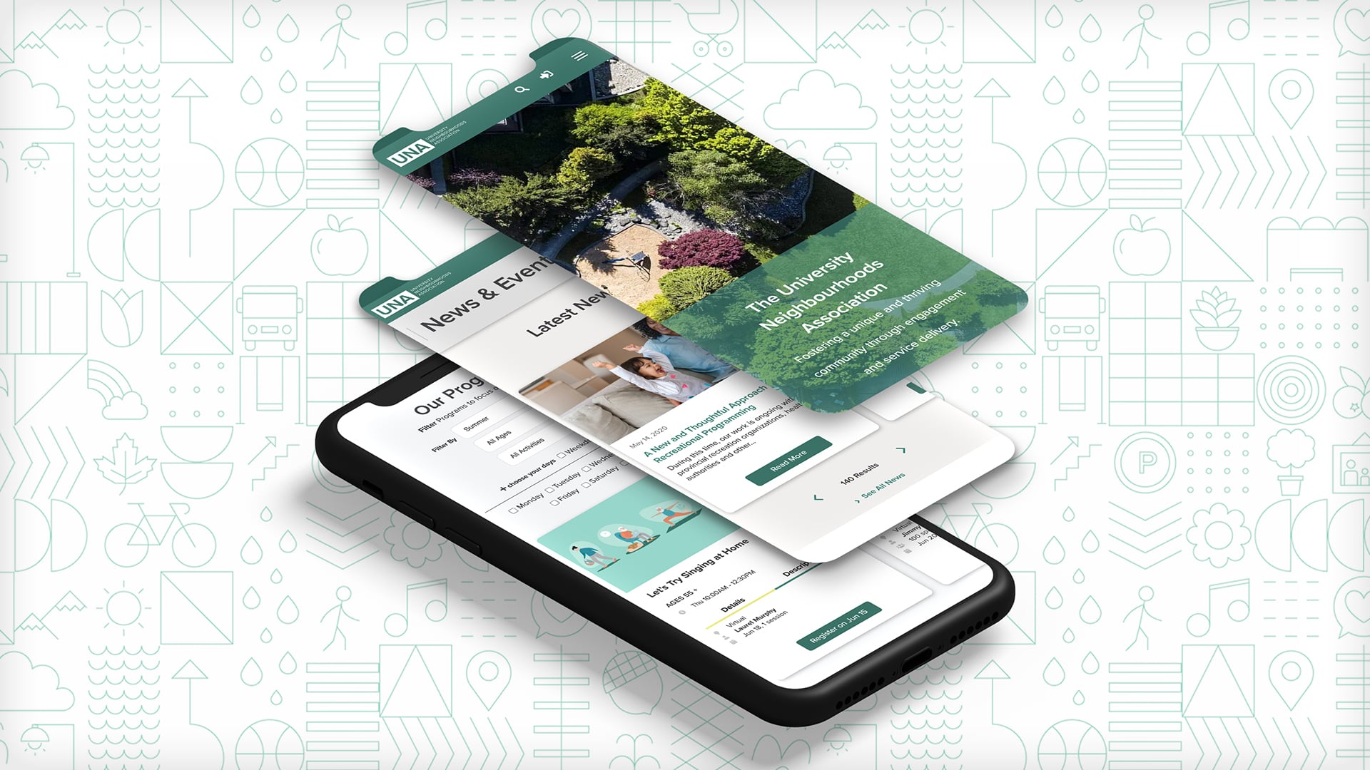
The new website is responsive for use on both desktop and mobile devices.
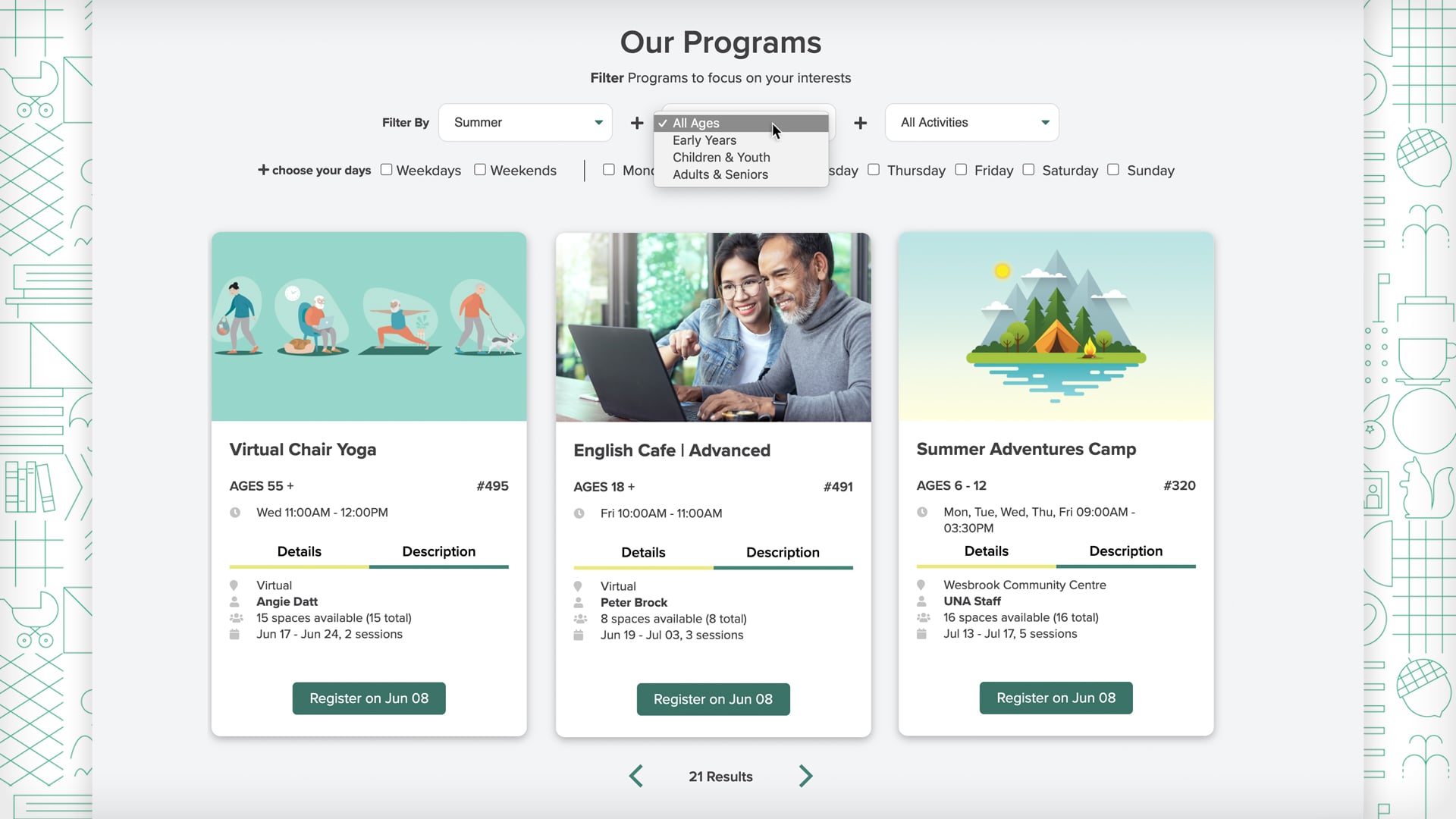
Integration with the PerfectMind membership & booking management software on the website plays a big part in streamlining the UNA’s operations.
Results
The redesign of the UNA website was a great success and the site is officially online as of June 2020, and KIMBO will continue to provide support for the new site to ensure that it remains up to date and bug-free.
The PerfectMind integration will significantly reduce calls to the front desk, giving as much information to the UNA member upfront. While the seamless integration on the frontend will reduce friction and increase online registrations (Program sales) as well as room rentals and bookings through the UNA website.
The flexibility of PerfectMind allows the UNA to serve its growing community without unnecessary complications and tedium. Employees of UNA can now address all membership and booking management needs in one place and streamline communication. While members/residents can now manage their memberships and scheduling online, reducing service wait times for end users and staff alike.


