Campaigns, Print

Ministry of Education and Child Care: Offshore School Program

Project Overview:

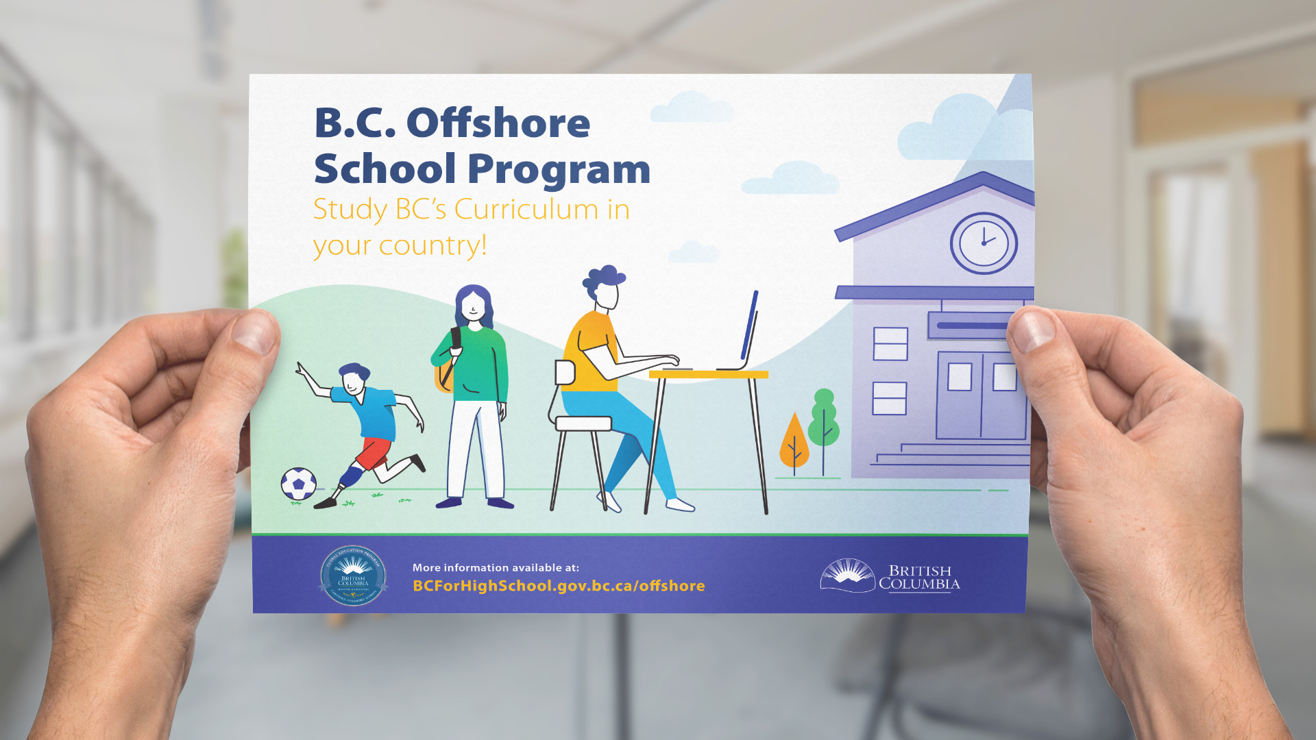
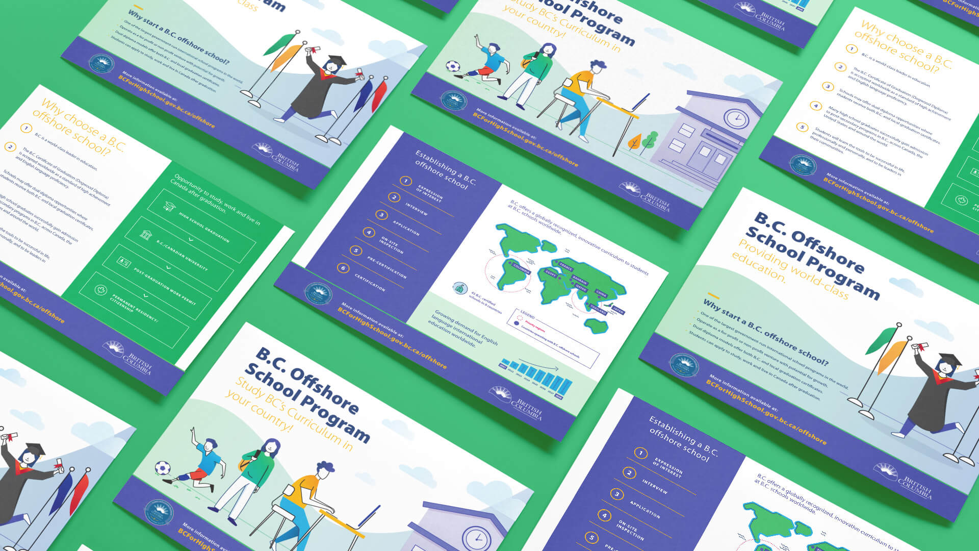
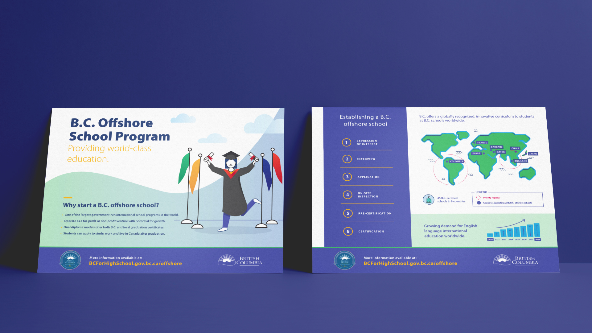
The Ministry of Education’s Offshore Schools project aimed to create multi-language promotional brochures that effectively communicated the value of B.C.’s education system to a global audience. By ensuring all materials aligned with key academic milestones and adhered to B.C.’s educational branding, KIMBO designed cohesive, culturally sensitive brochures that represented B.C.’s standards worldwide.

Related Case Studies:

Ministry of Education and Child Care: BC for High School Website


What We Delivered:

  • Multi-language Promotional Brochures
  • Consistent Branding
  • High-quality Print Materials


  • Creative Conceptualization
  • Infographics & Iconography Development
  • Document Design


The Challenge:

One of the primary challenges was managing a complex, multi-language project while ensuring cultural and linguistic accuracy. Translating promotional content into 17 languages required not only precise translation but also an understanding of cultural nuances that might impact how the material was received. Each language had its own set of challenges, from ensuring that messages retained their intended meaning to adjusting the design to accommodate differences in text length and character orientation.

Maintaining the visual and thematic integrity of the brochures across all languages was another significant challenge. The design team had to be meticulous in integrating translations seamlessly while preserving the cohesive visual identity of the Ministry of Education and Child Care.

Despite these obstacles, KIMBO’s ability to facilitate open communication and remain adaptable allowed the team to overcome these difficulties effectively. Our project manager ensured that timelines were adhered to while managing revisions and aligning deliverables with the Ministry’s expectations.


The Strategy:

First, KIMBO carefully structured the project timeline to align with critical academic and programmatic milestones, such as the start of the academic year and key enrollment periods. This strategic planning guaranteed that promotional materials would be ready for distribution at moments when families and school operators were actively making decisions.

Brand consistency was a crucial component of the project. KIMBO meticulously ensured that every design element adhered to B.C.’s established educational branding standards. By harmonizing colours, logos, typography, and imagery, the brochures effectively reflected the professionalism and quality of B.C.’s education system. The design team adopted an illustrative style that was visually appealing and accessible to an international audience. This approach conveyed the value of the B.C. curriculum while ensuring the message resonated across different cultural contexts.

The strategy also involved close collaboration with key stakeholders. KIMBO engaged MOSAIC translators to provide translations in 17 different languages and facilitated a thorough review process to guarantee accuracy. The team worked hand-in-hand with a printer to meet high-quality and durability standards, ensuring that the brochures could withstand international handling. By organizing regular feedback sessions and meetings, the project manager kept all parties aligned, enabling smooth communication and efficient revisions throughout the design and production phases.
 

Results

The project successfully delivered a cohesive suite of multi-language brochures that reinforced the Ministry’s educational standards and brand identity on a global scale. The materials were well-received by diverse international audiences, including prospective students, families, and school operators. By maintaining brand consistency and cultural sensitivity, KIMBO enhanced the global appeal of B.C.’s education system and positioned it as a leading choice for offshore education.

The use of 17 languages expanded the reach and accessibility of the brochures, making them an effective tool for engaging new markets. The high-quality print materials, which adhered to stringent durability standards, ensured that the brochures could withstand international shipping and handling. The coordinated efforts between translators, designers, and printers resulted in a seamless integration of content and design, demonstrating the value of B.C.’s curriculum in a way that resonated with stakeholders from diverse cultural backgrounds. Overall, the project set a high standard for future multi-language and culturally sensitive educational materials.

Let's create something incredible together!

More Case Studies