DIVERSEcity Community Resources Society (DIVERSEcity) is a non-profit organization that provides resources, services, and programs for immigrants in Canada. Having served the B.C. Lower Mainland area for 40 years, the organization’s existing website was deemed to be dated looking and hard to navigate; thus, was in need of a radical redesign to better help newcomers in the Surrey, Delta, Langley, and White Rock communities.
What We Delivered:
- Custom WordPress Website
- Document Repository
- Website Audit
- Website and UX Design
- WordPress Training
- Content Strategy
The Challenge:
One major challenge of this project was the vast amount of content that needed to be reorganized on the new website. As the targeted audience for the website consists of individuals from a variety of backgrounds and cultures, the website had to be user-friendly and easy to understand for users from a diverse range of backgrounds; and to allow for easy access to information, web content needed to be organized in a logical manner that is easy to navigate.
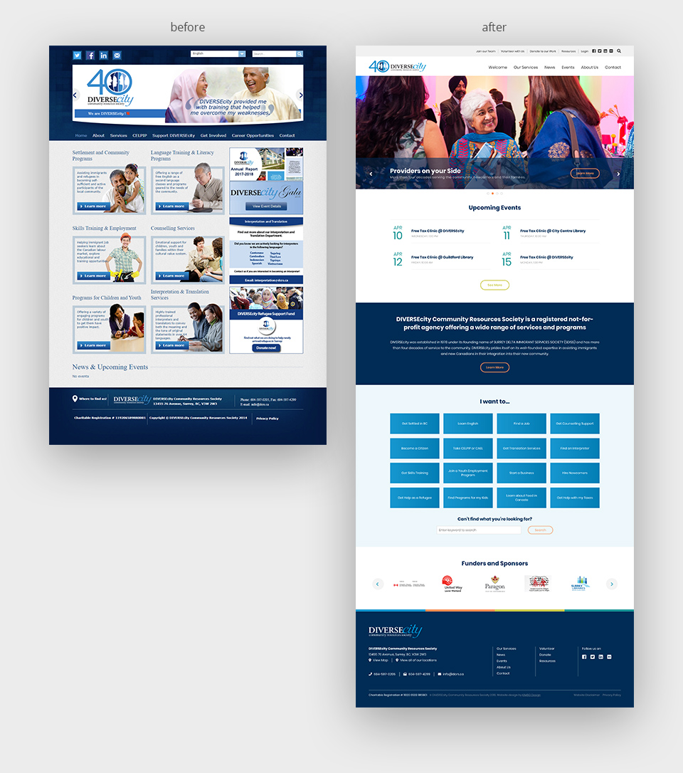
Before and after DIVERSEcity website redesign.
The Strategy:
Instead of having many small pages with minimal content, we categorized the bulk of the information and combined them in similar pages, giving the new website a more robust and smooth user-experience that involves less ‘jumping-around’ to different locations. As ease of navigation was one of the main goals that the redesigned website needed to achieve, we also introduced multiple methods of navigation (in the header, sidebar, and breadcrumbs) to ensure that content is as easy to find as possible for the user.
Another function that we implemented to make navigating the website easier was the inclusion of a documents repository. This is essentially a WordPress powered file database that has been custom programmed to include the ability to search within PDFs (i.e. searches both the title and content of the file itself). This allows for much greater flexibility in the search function as a user will be able to find a particular file just by searching for a line that they remember from within that document. Furthermore, the KIMBO repository is responsive for mobile devices and allows users to directly view documents in their browser, eliminating the need for additional applications to be installed (e.g. Microsoft Office). This is coupled with built-in functionality for converting documents between XLS, PPT, Word, and PPT, along with the ability to download the original file format for maximum flexibility.
While the KIMBO repository is custom programmed from scratch, it is compatible with Linux servers that run on PHP just the same as a typical WordPress site. Meaning that the said repository can be integrated into most modern WordPress websites in the market nowadays. The KIMBO repository also has password and leech protection built-in, though it is recommended that a website be hosted on an SSL-certified dedicated server for maximum protection.
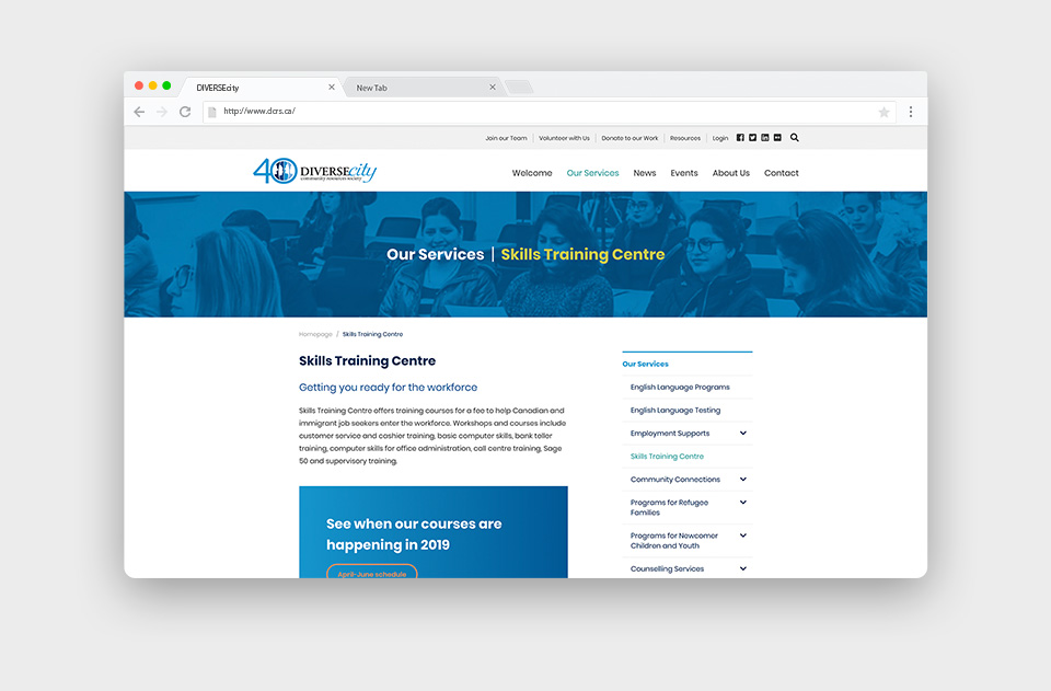
DIVERSEcity website navigation menus.
Since the targeted audiences for DIVERSEcity services often come from a variety of cultural backgrounds, we included in-language versions of the welcome page to ensure that language barriers do not prevent someone from getting support from DIVERSEcity. To bring the new DIVERSEcity website in-line with contemporary web designs, we opted for a clean, minimalist layout with a modern look. We also added a number of dynamic design elements into the site, which includes a clickable animated slideshow and ‘lazy loading’ animations, among others.
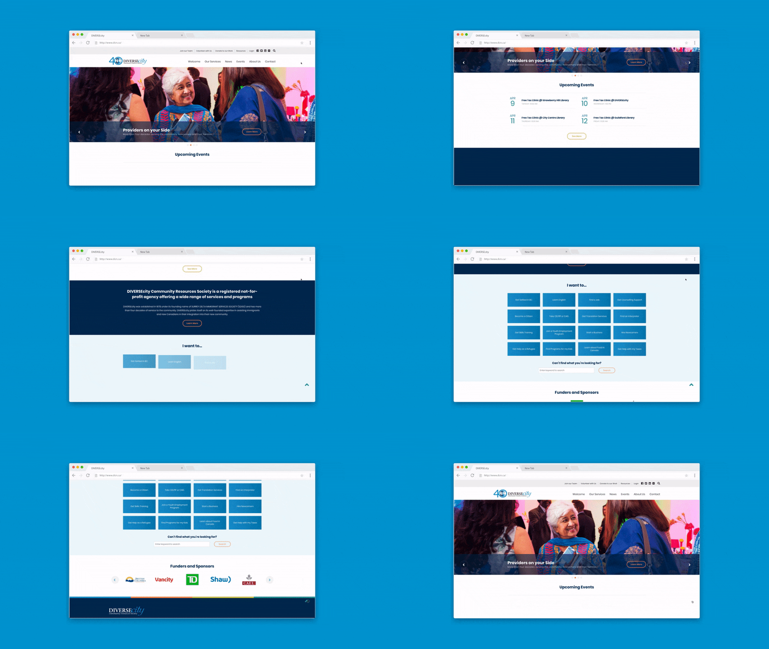
Animations built into the homepage of DIVERSEcity website.
Results
DIVERSEcity staff members were highly satisfied with the redesigned website. The brand new online presence for the organization now features new images with a fresh design, is much easier to navigate, and more modern looking with a bright and cheerful colour palette. On the backend, it is easy to maintain and allows for the future-proof site to be continuously updated without the need for programming knowledge. Most importantly, the new website now features a responsive design that dynamically optimizes itself for viewing on different mobile and desktop devices. In an increasingly mobile-oriented world, this new site allows DIVERSEcity to serve and connect with its communities more efficiently than ever before.


