Coast Mental Health has been helping people recover from mental illness for over 45 years, through the provision of housing, support services, and employment/education. They came to KIMBO because they wanted a dynamic new website, which would be used as the backbone for their fundraising efforts. Coast Mental Health also wanted the site to be story–based, driven by the inspirational stories of real CMH clients, and their triumphs over struggles with mental health.
What We Delivered:
- Website Development
- Donation Page Integration
- Website Design
- Custom WordPress Development
The Challenge
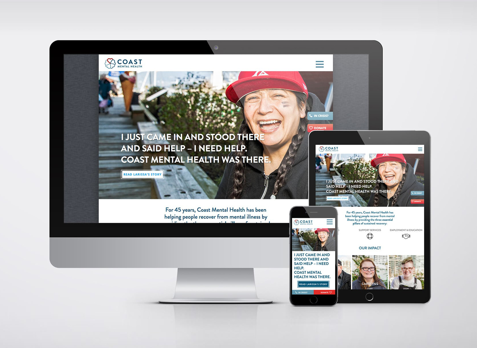
The main goal for this website was to avoid being just another “facts and figures” website, bogged down by information. As was mentioned above, CMH requested that the new website be built around the personal stories of the people they help, as a way to emphasize their personal approach to mental health. We also needed to make fundraising a priority for the website, but without it coming off as aggressive, so that people didn’t feel as though they were being pressured into donating. Another thing that CMH didn’t want was for the website to become a massive list of resources, because this isn’t the kind of service that CMH provides. This kind of list would also draw away from the stories, and cause the website to conform to the “facts and figures” template that we were trying to avoid.
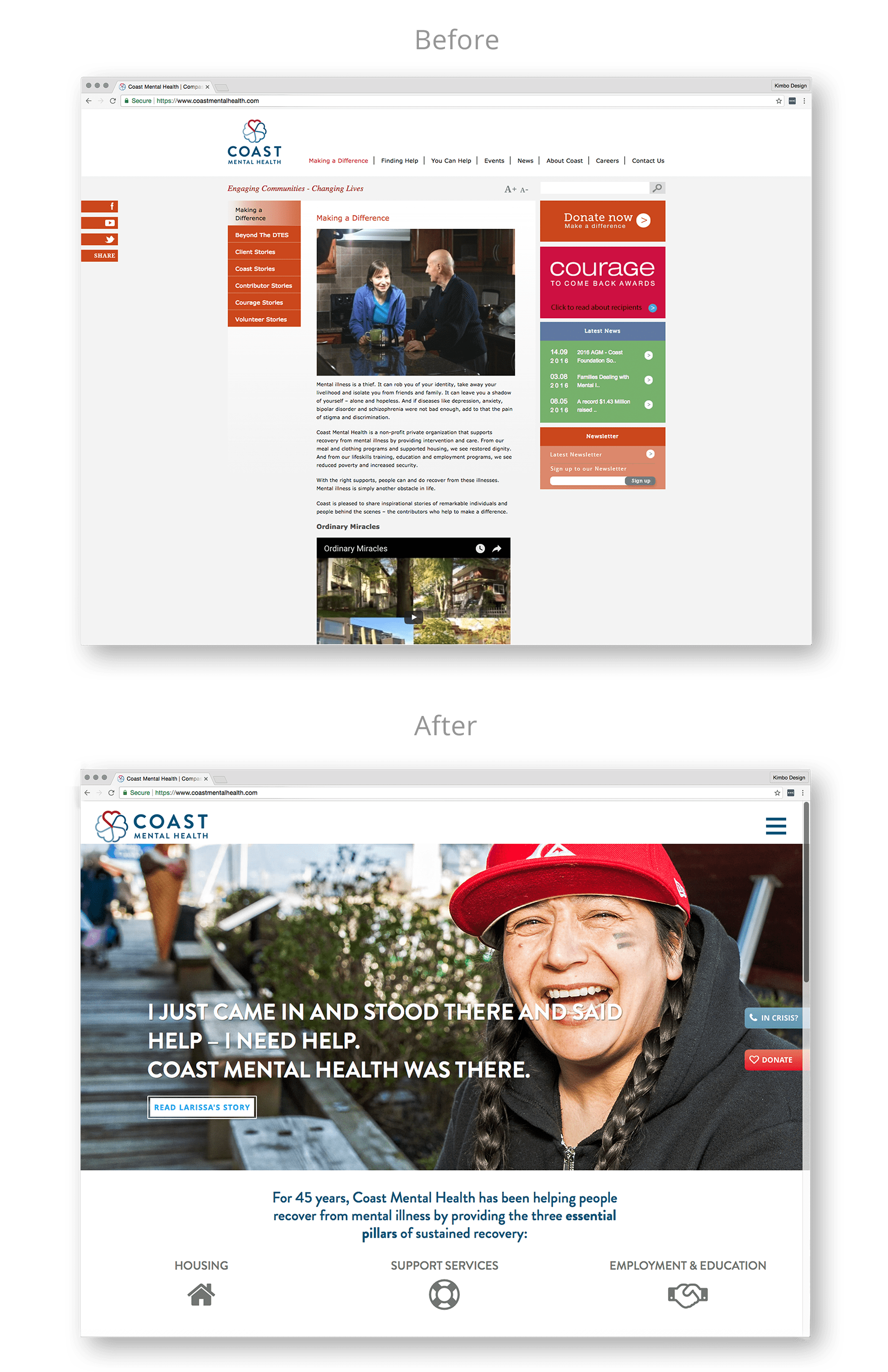
The Strategy
Front and centre on the website’s homepage, we placed pictures and stories of several CMH clients: Larissa, Larry, Carolyn, and Charlie. Through these stories, we explained how CMH had helped these people through their three essential pillars of sustained recovery: housing, support services, and employment/education. This approach helped to produce concrete evidence for what CMH does, whether helping Larry find a home after years on the streets, giving Carolyn the opportunity to support others with mental health struggles as CMH’s Senior Outreach Manager, or helping Charlie find a place in Coast’s Culinary Skills program. For the Donation page, we wanted to put a personal face on it so that people could see the direct impacts that their donation could make. The donation page also gives people a range of options for donating, from one-time gifts to leaving money in a will. Additionally, the ‘Fundraise Your Way’ page allows the CMH team to feature events that they want to highlight to the public.
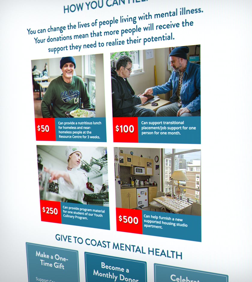
The ‘How You Can Help’ page features prominent Donation paths that show that no amount is too low; even a one-time $50 donation makes a difference.
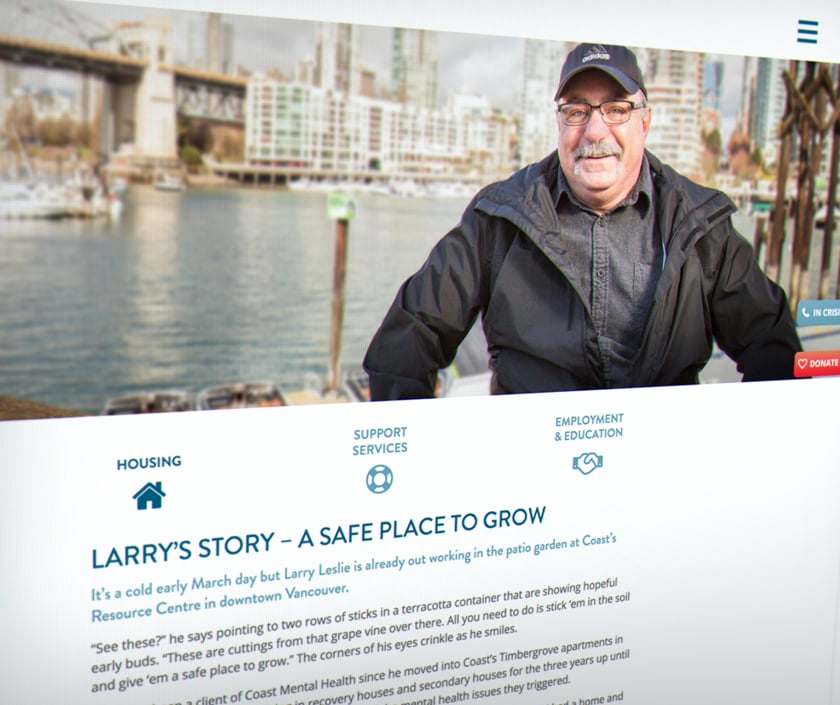
Authentic personal stories are key to Coast Mental Health’s new website. We threaded the personal stories of CMH’s clients with their provided services. In this example Larry’s mental health had deteriorated to the point where he was living outside in the woods, so Housing was a natural bridge in getting him back to a good place.
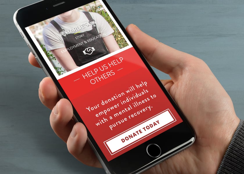
One of the key objectives of the website is to generate donations for the society so that they can keep doing their best work with the Vancouver’s community that needs it so much. We put a strong focus on the call-to-actions and to keep them top of mind as visitors navigate the website regardless of what they’re viewing it on.
Results
We handled the delicate donation issue by including a floating donation button on each page, and a donation call-to-action at the bottom of every page. This leads people to the donation page, which spells out that no donation is too small, without clearly saying so. It notes that ‘even $50 can provide a nutritious lunch for homeless and near-homeless people at the Resource Centre for 3 weeks.’ We did have to include some facts and figures talking about what CMH does, such as on the Housing page, including a map of the housing spectrum they oversee in collaboration with local health authorities and other organizations. To avoid the information overload, we have an ‘In Crisis?’ button for those seeking immediate help, who may have landed on their page through an organic Google search. This button points them to more appropriate places for immediate mental health issues. Our website design was also filled out by excellent high-quality photography, showcasing Vancouver and the clients who had their stories featured.


