KIMBO was commissioned by the City of Vancouver & Small Business BC to produce 13 Market Area Profiles in this project, where we provided document layout, graphic design, data visualization, and copyediting services. These profiles showcase key Business Improvement Areas (BIAs) in Vancouver and act as comprehensive reports that provide potential investors with the information necessary for understanding the business climate of each market area.
What We Delivered:
- Document Design & Layout
- Creative Conceptualization
- Data Visualization
- Graphic Design
- Infographics & Iconography Development
- Copyediting & Proofing
The Challenge:
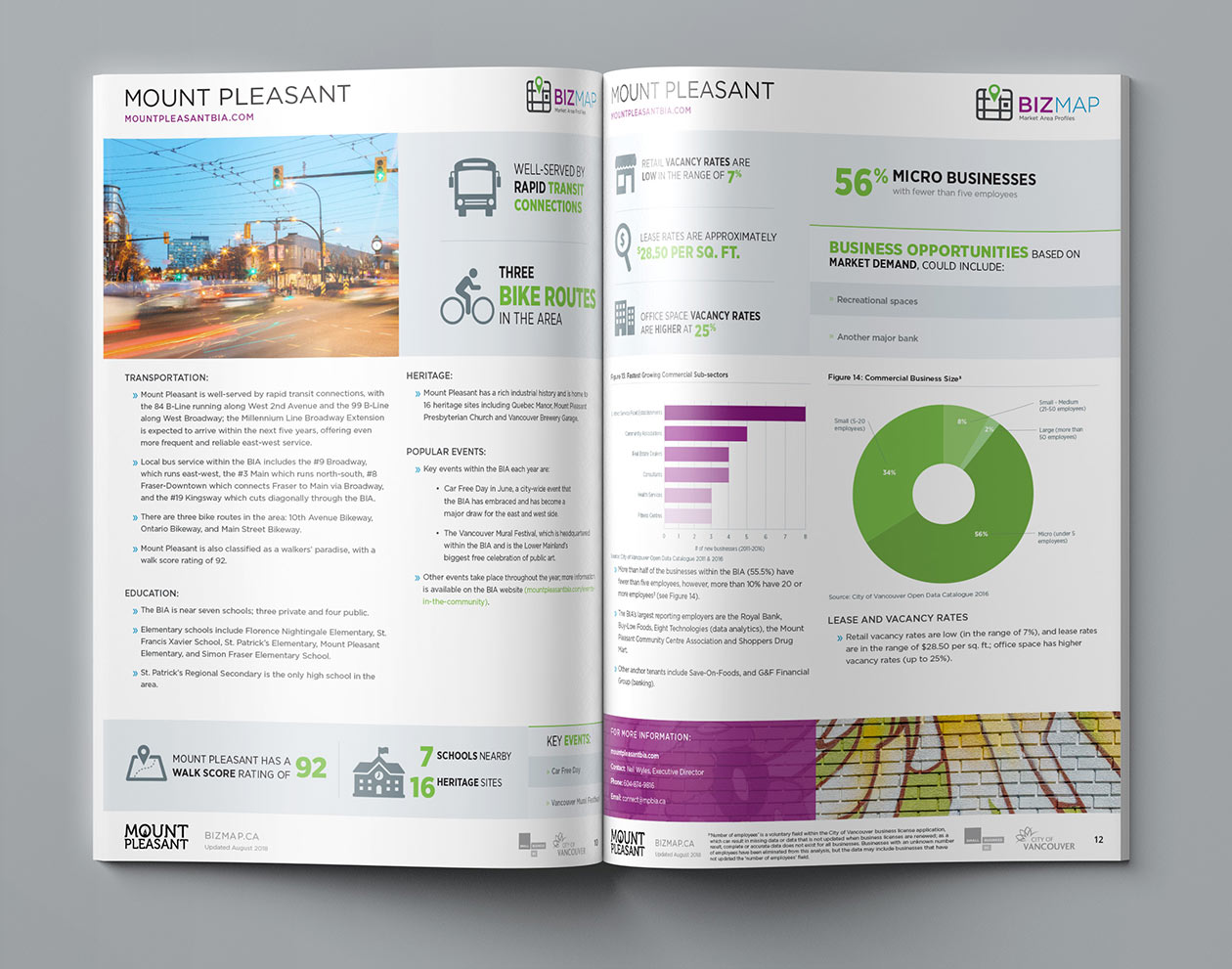
The Mount Pleasant BIA profile.
In addition to finding innovative ways to present the content, statistics and information in an engaging format for the target audience were two challenges unique to this project. The first involved developing a creative typographic solution that balances practicality and in-trend design elegance. Secondly, was figuring out the strategic placement of graphics within the profiles to act as text breaks and increase readability for the data-heavy documents.
The Strategy:
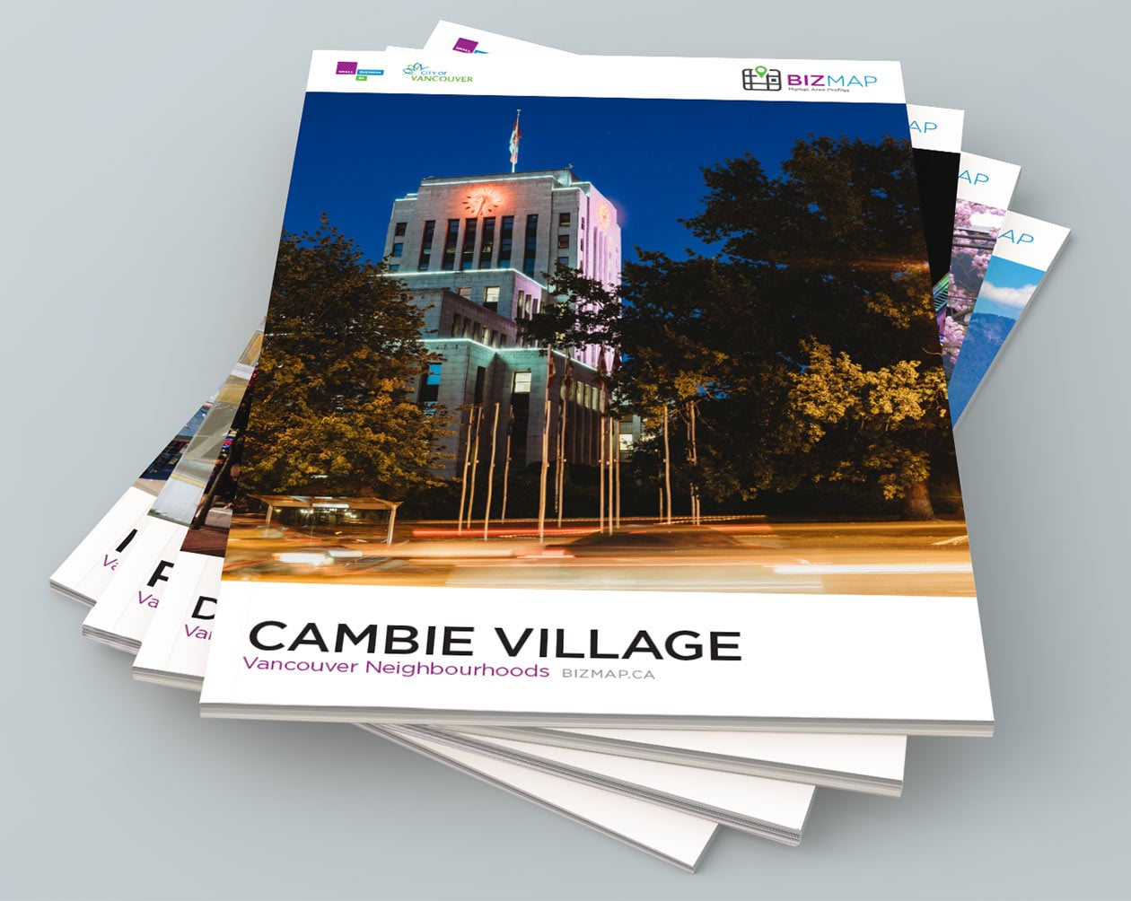
Cambie Village BIA covers.
Our solution to the challenges was the heavy utilization of infographics and custom-designed iconography. Our approach to data visualization featured vibrant colours combined with clean, solid graphics. We worked closely with project stakeholders at the start of the project to establish a fact sheet of the essential scope of information that needs to be included in all profiles. We then developed a set of clean vector-based iconography that was used throughout all of the documents to categorically present data with a unified look and feel. The result was visually-striking profiles that are easily comprehensible for the average reader.
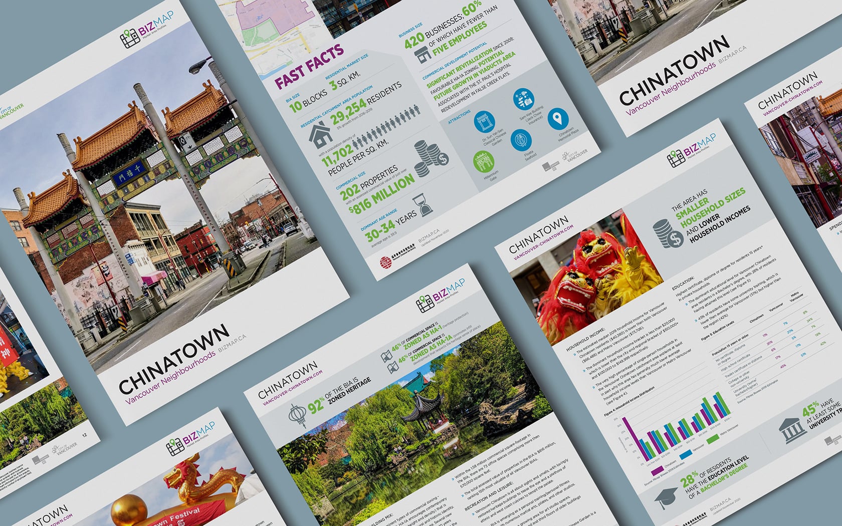
Overview of the Chinatown BIA profile pages.
Being a text and data-heavy document intended for public viewing, the report required not only creative graphics and layout to increase readability, but also our utmost diligence during production to remain accurate in presenting information about the various Vancouver BIAs. In addition to our custom-designed infographics and iconography, we opted to integrate a wide range of photographs taken from the respective market areas, which are accompanied by accents of different colours within the text.
Results
Feedback from the City of Vancouver & Small Business BC has been tremendously positive for our work done in this project. Project stakeholders and targeted audience have all found the new Market Area Profiles to be highly engaging and effective in presenting the necessary information about BIAs for potential investors. The profiles produced were also proven as valuable presentation resources for meetings with prospective business owners and investors.


