B.C.’s Environmental Emergency Program (EEP) leads the province’s response to hazardous material spills and other environmental emergencies. KIMBO Design was brought on to design a report document describing Environmental Emergencies Program activities for the period from October 2017 to March 2019.
Ministry of Environment
What We Delivered:
- Creative Conceptualization
- Document Design & Layout
- Graphic Design
- Photo Editing
- Typesetting
- Proofing
The Challenge
As a text-heavy document, we knew from the start that creative layouts and graphics/imagery placements throughout the report to break up large chunks of text would be a key challenge. This is necessary to keep the reader engaged and achieve the ultimate purpose of informing the public about the EEP and its work in the province of British Columbia.
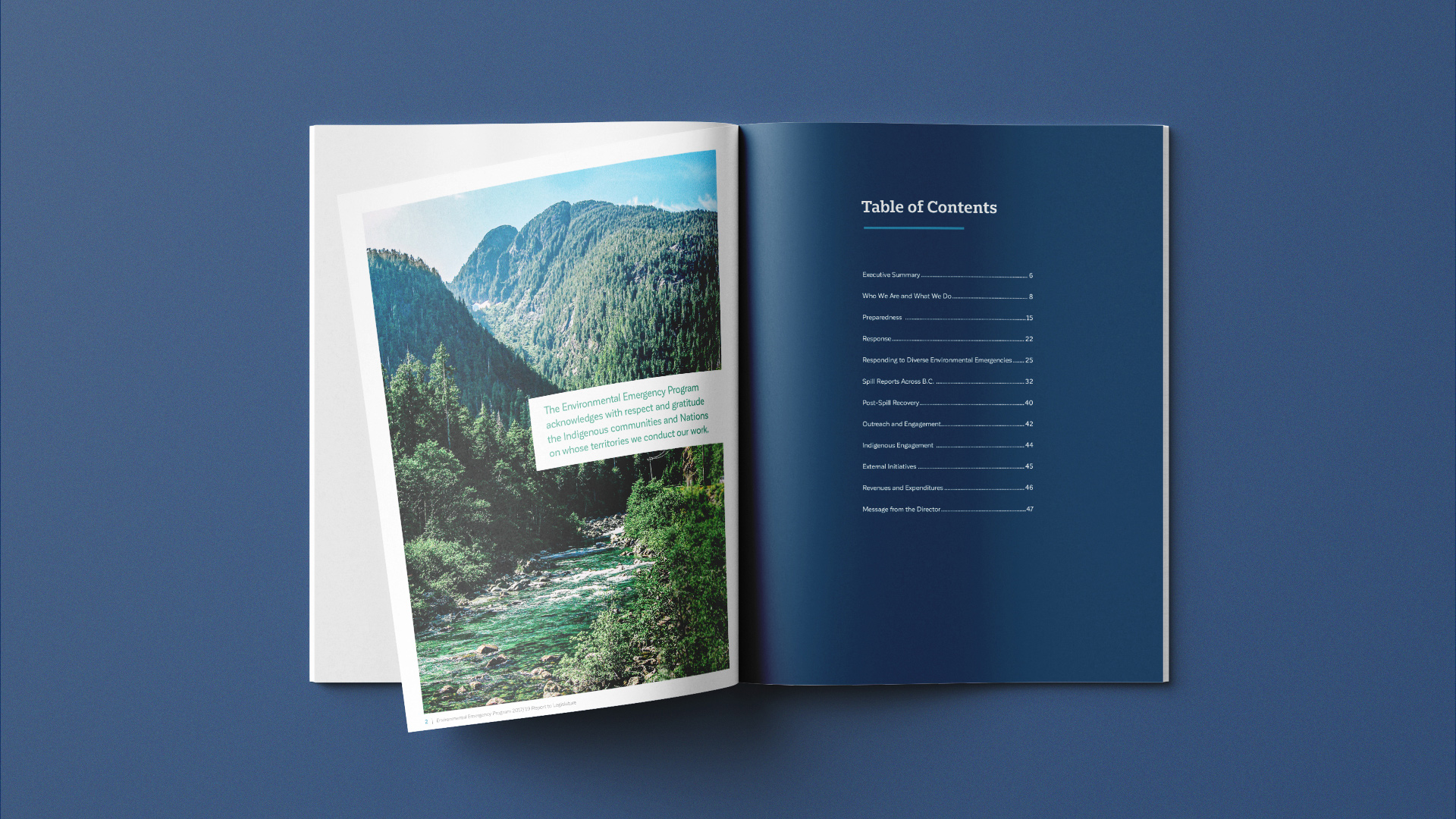
This report covers a number of different topics related to the EEP.
The Strategy
The overarching design style was developed with the intention of closely matching the content as well as the brand of the Ministry. Photos to be included inside the report were provided to us by the Ministry. Our team then proceeded to perform retouches and edits to ensure that images adhere to the overall colour scheme. These along with custom-designed graphics are then strategically placed throughout the document for improved readability. Some information from the report was also visualized as simple, easy to comprehend diagrams/graphics, eliminating the need for cumbersome data tables and long text paragraphs.
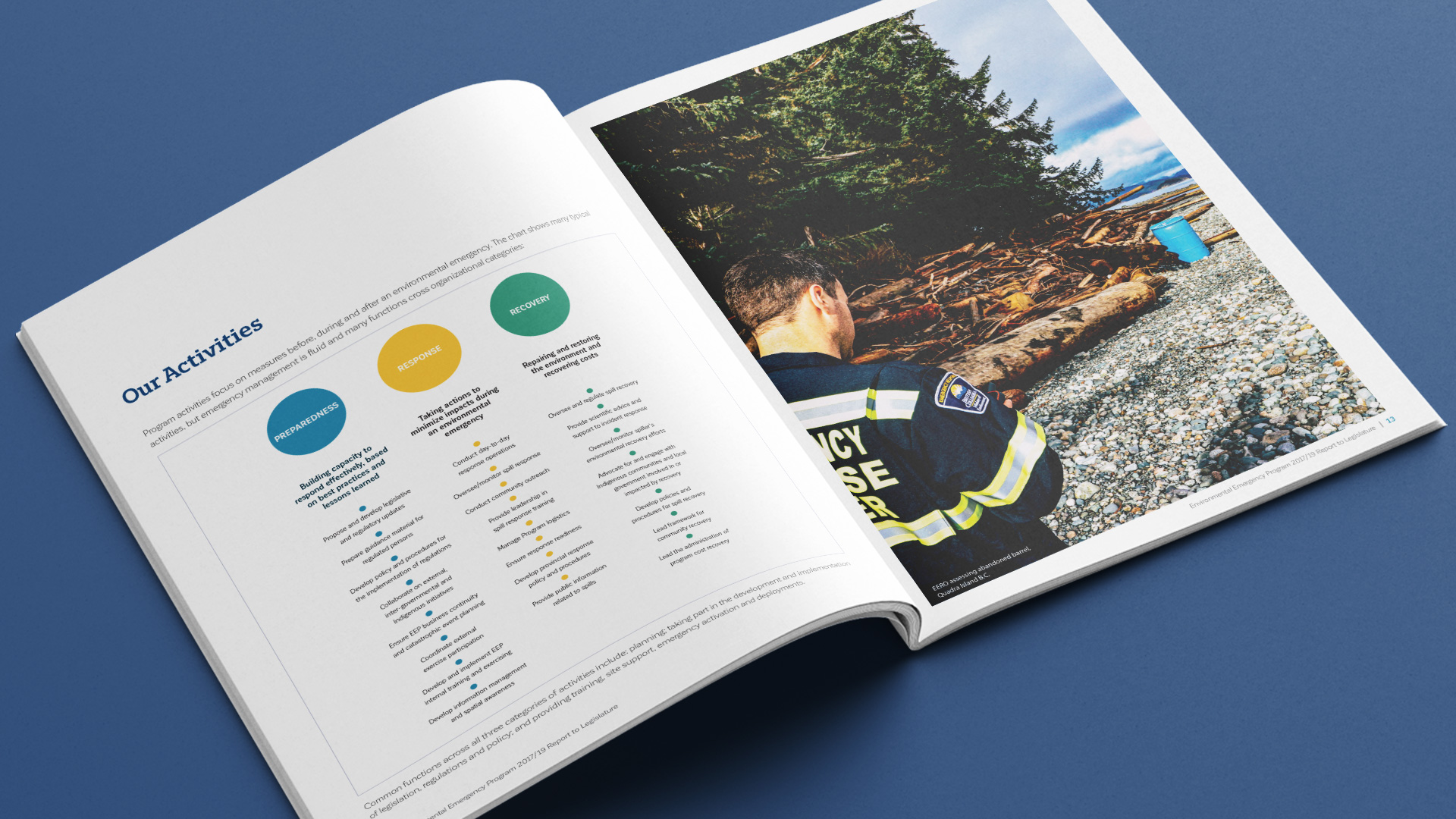
Images and custom graphics were strategically placed throughout the document to improve readability.
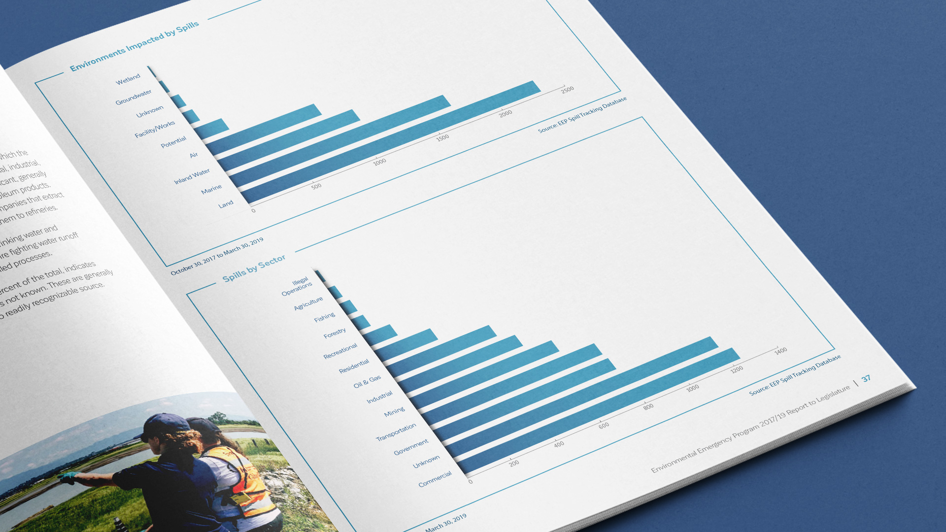
Diagrams and charts were used to visualize data.
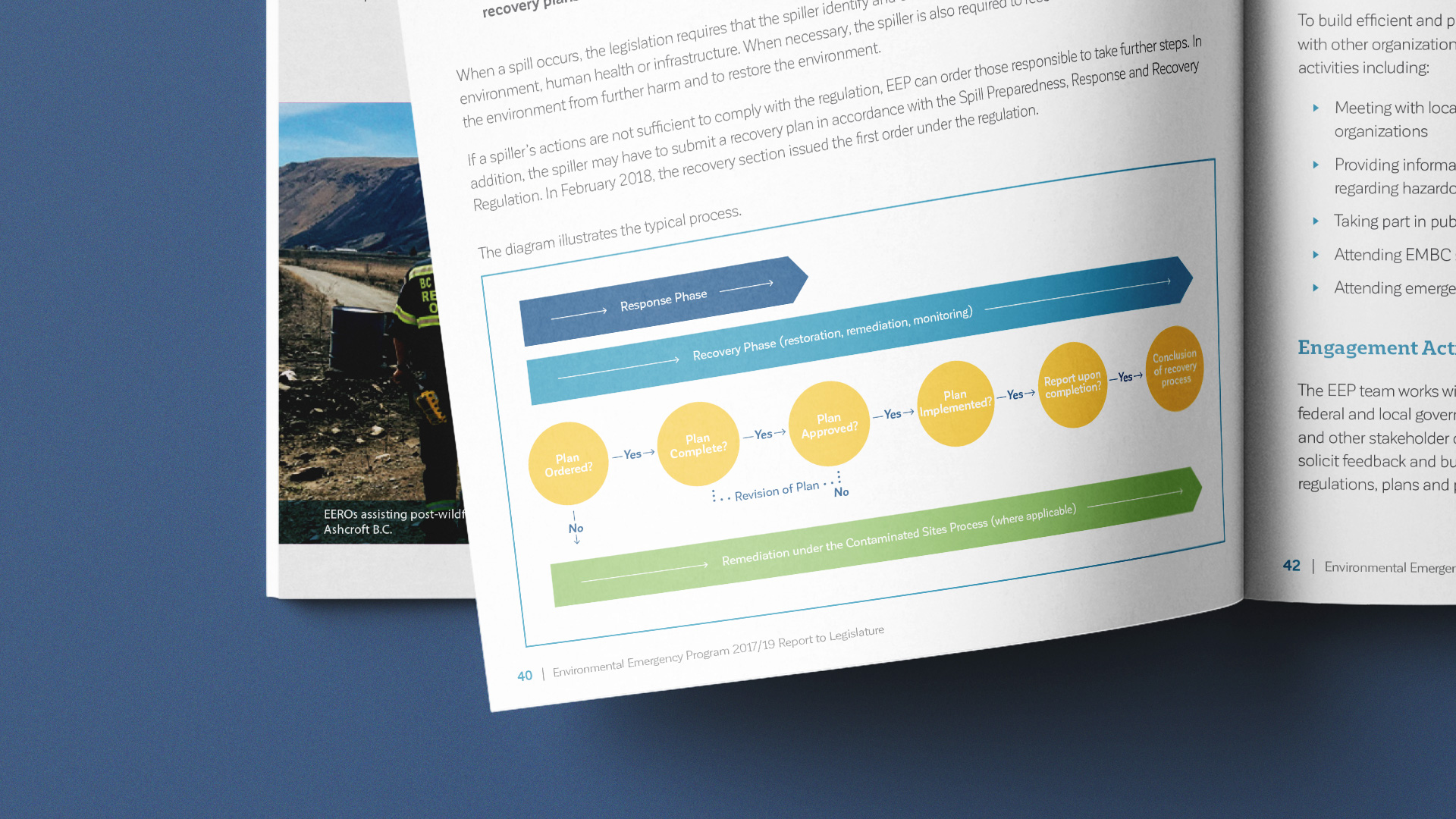
All designs adhere to the overall brand of the Ministry and the EEP.
Results
The end product was an engaging 48-page document optimized for both print and digital distribution. The report serves the important purpose of informing the public about the EEP, environmental emergencies and spills across B.C., and the work that had gone keeping the province safe from hazardous material spills and other environmental emergencies.


