Packaging, Web Design

La Petite Souris

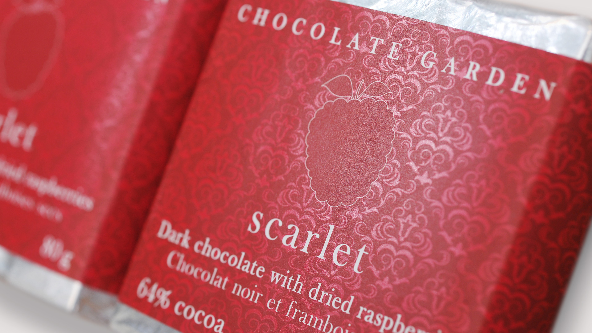
Chocolatier La Petite Souris wanted to entice their customers with sophisticated packaging design. Their raspberry flavoured Scarlet was our first project with them. The original design for the raspberry flavoured chocolate bar, inspired by the art nouveau and arts & crafts movement, tempted customers to look and touch the decadent chocolate, and then devour it.

Scarlet’s seductive look and feel comes from the floral design, art nouveau typeface, and contrasting flat raspberry outline. All the design elements were created to entice the chocolatier’s customers, suggesting a delightful chocolate morsel waiting under the packaging, one to be coveted.

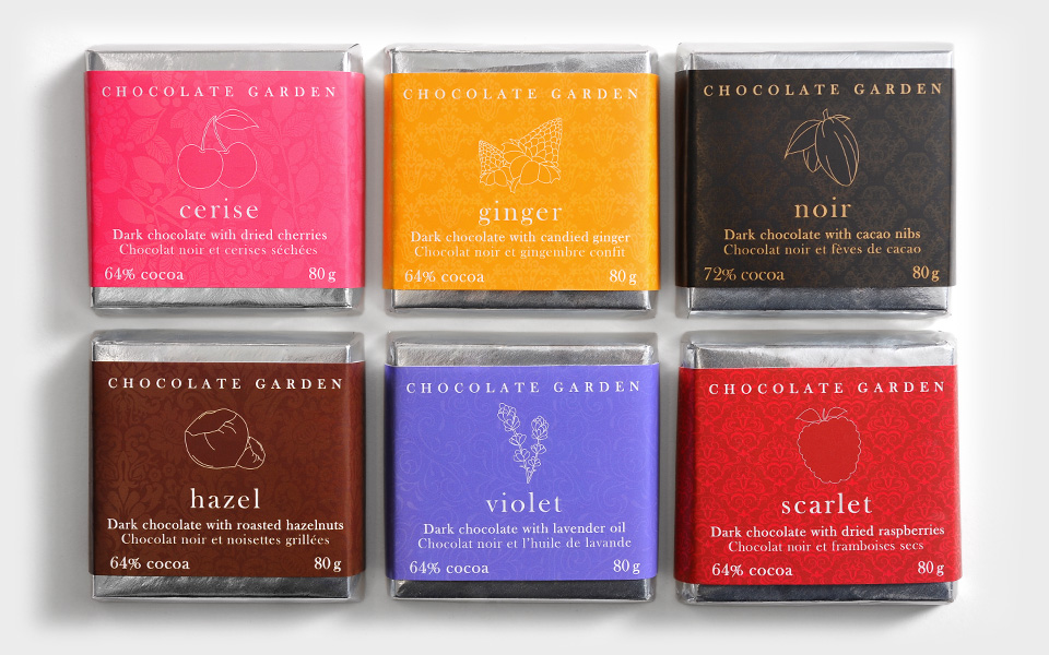
Charmed by our first design, La Petite Souris hired our team to design packaging for the next five bars in their Chocolate Garden series.


 

What We Delivered:

  • Chocolate Bar Packaging
  • Illustration
  • Print Management


  • Product Bar Codes
  • Product Naming & Description
  • Brand Strategy


The Challenge:

Having created the packaging for Scarlet, our team took a similar design approach with the five new bars. KIMBO Design wanted to have the series complement the essential ingredients of each handcrafted bar, and maintain recognition/continuity with the original theme we had created for Scarlet. Our challenge was to entice chocolate lovers to try each flavour in the Garden series.

Body_LaPetite_1

 
We selected KIMBO Design originally because of the time Kim took to discuss our needs in our initial phone conversation. While working together, KIMBO Design adeptly took a vision for a line of chocolate bars and transformed it into packaging that stands out and continues to receive compliments. KIMBO went the extra mile by guiding us to environmental print alternatives, coordinating our needs for smaller print jobs, and overseeing the details of printing, right down to colour matching. We are happy with our choice and love our packaging!
Amber Stoby
Amber Stoby
Owner/Operator, La Petite Souris Chocolate
 

The Strategy:

We continued the floral pattern on the packaging designs for Hazel, Violet, Cerise, Ginger and Noir. Solid icons for each bar, highlighted with subtle outlines, were created. This, combined with the art-nouveau typeface, added an element of modern refinement, and we completed the look with an elegant varnish and matte finish.

The rich and evocative design tempts chocolate lovers, encouraging them to sample each item in the Garden. The team at KIMBO even sampled each flavour, obviously for strict and professional purposes.

scarlet-slide-new


Results

La Petit Souris packaging design won a 2012 Summit Award for the Chocolate Garden series. KIMBO Design was also a finalist in the 2012 Design Edge Reggie Awards for the Garden series.

Let's create something incredible together!

More Case Studies