Campaigns, Infographics, Print, Web Design

Alzheimer’s Society of BC

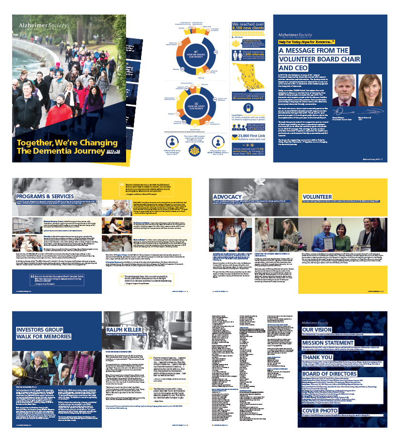
Annual reports are a challenge. How do you create a report that includes all the information that needs to be conveyed, while also compelling your audience to read it cover to cover?

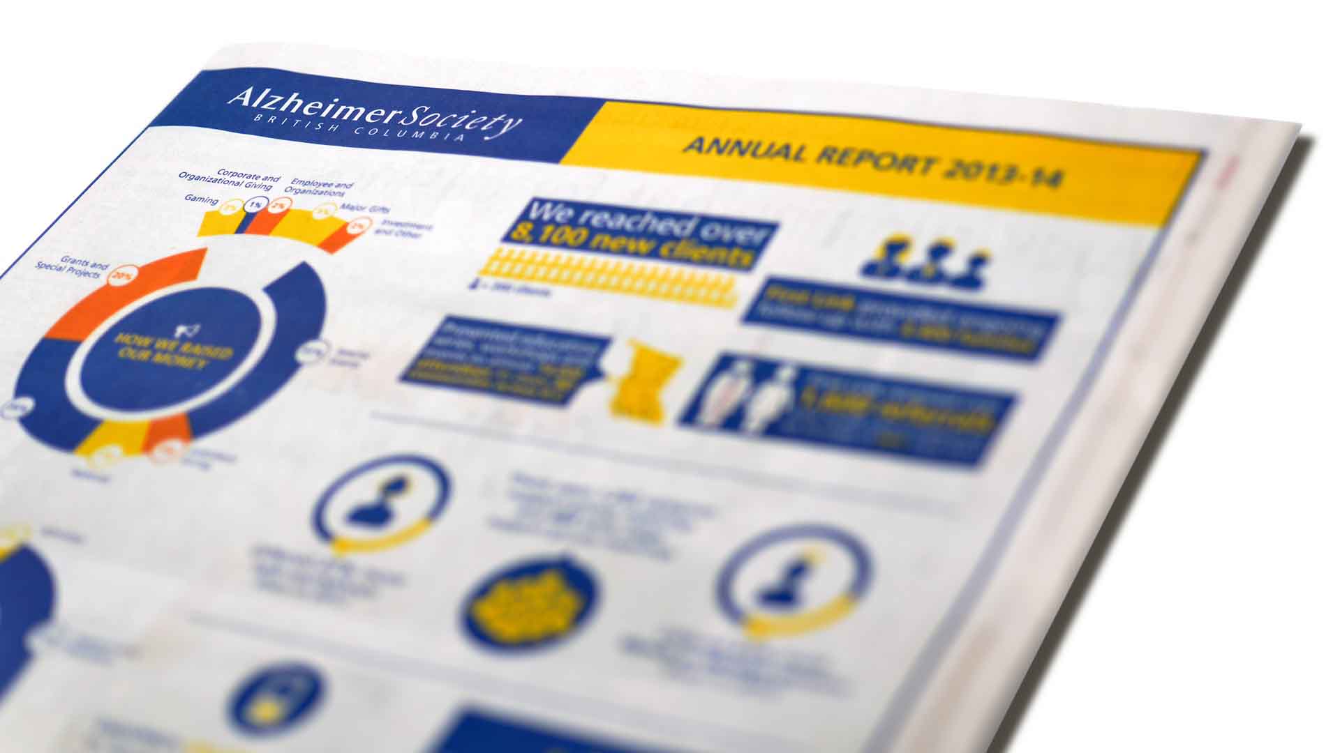
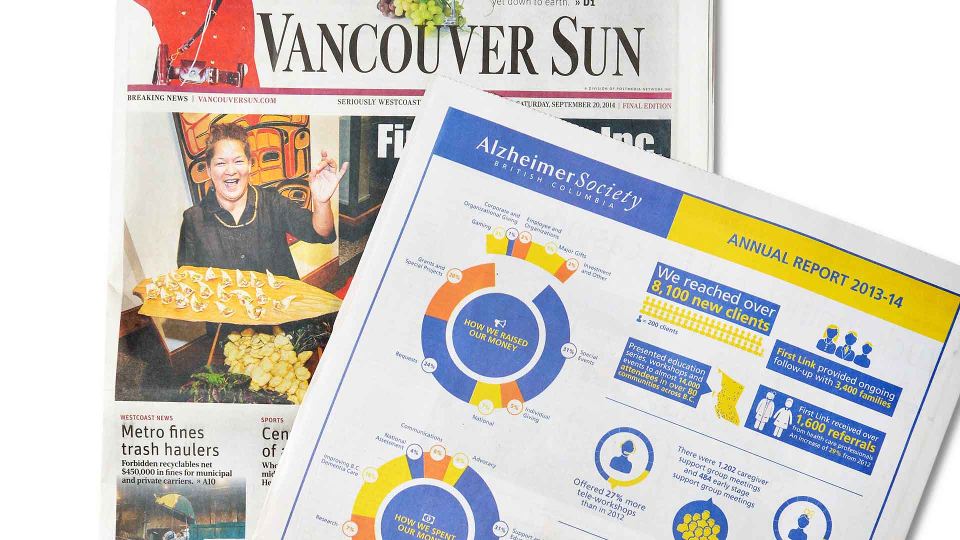
Our report for the Alzheimer Society of BC achieved this by using stand out graphics and introducing the 2013-14 data in an eye appealing manner, in a layout that is easy to read. We managed this through collaboration with the Alzheimer Society’s communication team, ensuring that the messaging, copy and design had an emotional trigger appealing to all of their readers, including current and potential donors.


 

What We Delivered:

  • Annual Report
  • Data Visualization


  • Graphic Design
  • Copyediting & Proofing


The Challenge:

KIMBO worked with the Alzheimer’s communication team to design and develop the 2013-2014 Annual report. Their main objective was to communicate their financial information in an easily-digestible way, so we recommended the use of an infographic approach to best communicates the complicated data.

alheimer-image

 
From the time of our first meeting at the KIMBO Design office in downtown Vancouver, I was impressed by the breadth of sectors KIMBO had created winning campaigns for. I was also impressed by the consideration Pickett and her team gave my organization, the Alzheimer's Society of B.C., as a client from the not-for-profit sector.
Christine Leclerc
Christine Leclerc
Director, Marketing & Communications, Alzheimer Society of B.C.
 

The Strategy:

The look and feel of the report had been stale in the past, so the Society wanted to design a forward-looking print piece, without losing the integrity of their brand. We introduced more yellow as an accent colour, which gave energy to the document. We then used our creative abilities to design their financial information into an engaging, easy to understand infographic, and created each section using a narrative, magazine style format. Collaboration with the communication team informed the design and kept the tone of the document in check with their style guide.

13

14


Results

Christine Leclerc said the annual report was a valuable piece, which is often used in face to face meetings with donors because it clearly documents the Society’s past year and its vision for the future. The numbers are accessible, as the infographic simply explains the data and shows the transparency of fund allocation and use. The society loved the look and feel so much that they hired us to design and develop their primary brochure, which will be printed and published in January.

Christine was extremely happy that we were able to make the absolute most of her budget. We even went so far as to recruit creatives who were interested in donating additional services to the cause and we were greatly pleased to see the success of the reach of our design, as it rippled out and was used in their Vancouver Sun ads and posted on their social media profiles.

Let's create something incredible together!

More Case Studies