Incorporating insight from our 5+ years experience with the BC Government, our strategy aimed to connect with British Columbians through a variety of innovative advertising platforms. We introduced several platforms and channels that diversified the ways that British Columbians would engage with the creative. Through careful co-ordination and execution of production elements, we achieved speed to market by launching creative quickly. For these campaigns we adjusted headline ad copy so it worked in specific channels. This level of detail in the execution adds strength to the campaign performance, which translates to effective communication about the initiative and tax grants. Through this strategy, the BC Government was able to reach and interact with British Columbians in new and more meaningful ways.
During this six to eight month campaign, the Government Communications and Public Engagement staff often asked us to create images within tight timelines. We created banner ads and profile images, as well as images for storyboards that GCPE’s large agency partner used to create TV spots. The strength and value KIMBO offered to this campaign was our ability to support other vendors with creative assets, as well as executing print and web materials, while maintaining WorkBC’s existing brand standards.
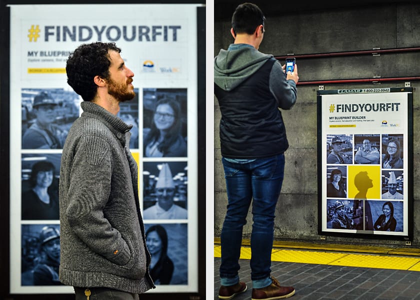
The KIMBO team built upon the previous year’s BC’s Skills for Jobs Blueprint creative assets to enhance the visual appeal for the target audience. Speed to market was very important to our stakeholders, so to meet the compressed timeline, we used existing brand elements and creatively extended the campaign so it would better engage with the intended audience. We designed a silhouette graphic with versions showing men, women, boys and girls, because the intended audiences would see themselves represented inside the different silhouettes, and the associated skilled trades.

WorkBC Blueprint Builder #FindYourFit transit platform silhouette ads.
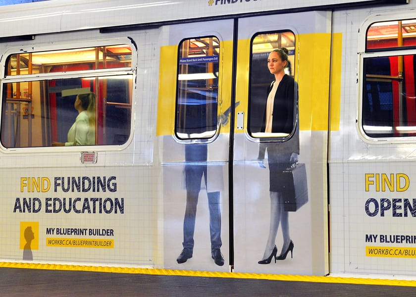
KIMBO made creative use of the Skytrain windows by developing graphics of the lower body of different types of workers on the trains’ exteriors. Actual passengers’ upper bodies, when seen through the windows, took their place at the top of the graphic, completing the form. Viewed from the outside, the passenger seamlessly “became” the worker, a graphic metaphor of how individuals fit into skilled trades employment, and how anyone can benefit from a career in these trades.

WorkBC Skytrain wrap with person in window
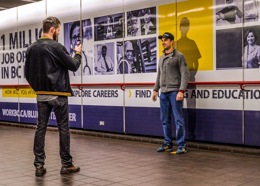
The creative that KIMBO developed acted as a mirror, encouraging the audiences to see the opportunity for a promising career in the skilled trades. Additionally, the use of yellow stood out in all media, prompting a high level of public interaction. In particular, the yellow footprint cutouts installed at Skytrain stations were very popular with the intended audience. Many members of the public had their photos taken while standing on the cutouts.

Bystanders shot photos of themselves standing on the yellow footprints against the wall.
The social media channels that we chose for this campaign were Facebook, Twitter, and LinkedIn. We leveraged our contacts at these companies in order to maximize the effectiveness of our creative and ad placement. We primarily used video ad units to drive traffic to the WorkBC and .Gov websites, while static ads were used to inform people about specific initiatives and personal success stories. From our previous year’s experience, we understood that Facebook and pre-roll had the highest recall in digital. This information gave us proof that emphasizing these creative outlets was the best strategy to reach the most people throughout the province.

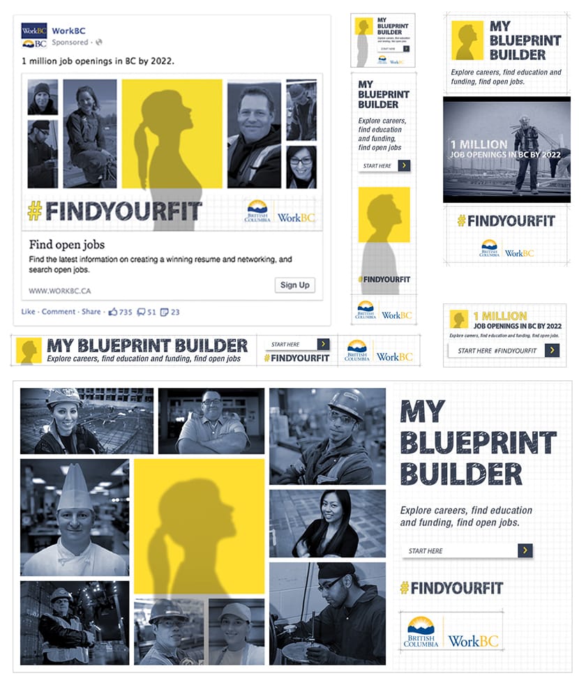
WorkBC Blueprint Builder social media ads.
Our tactic was to match the creative for the online buy with the mass media buy (TV, radio, etc.) for maximum impact. Our strategically positioned dynamic and static ads were located on high-traffic sites visited by our target audience. Display ads prominently featured the personal and relatable stories of three individual workers, as encouragement to drive people to the WorkBC and .Gov websites. Our display ads were also featured on homepage takeovers of the Vancouver Sun and Vancouver is Awesome.
We also used native advertising to deliver key messages by integrating advertisements into storylines in each publication and aligned the content to the editorial style. We used Postmedia, Vancouver is Awesome and Vancity Buzz to deliver our strategic content pieces. Articles were written and formatted differently for each platform.


