Vision Vancouver wanted to rebrand its image to trigger progressive values in a fast-evolving city divided along ideological lines. KIMBO Design provided sleek, strategic adjustments to their logo and design, to implement a revitalization of their website and social media initiatives.
Branding, Campaigns, Print, Social Media, Web Design
Vision Vancouver
What We Delivered:
- Re-brand
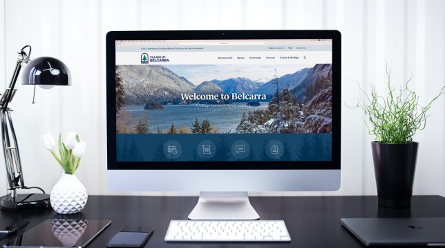
- Website Re-design
- Signage - Banner Design
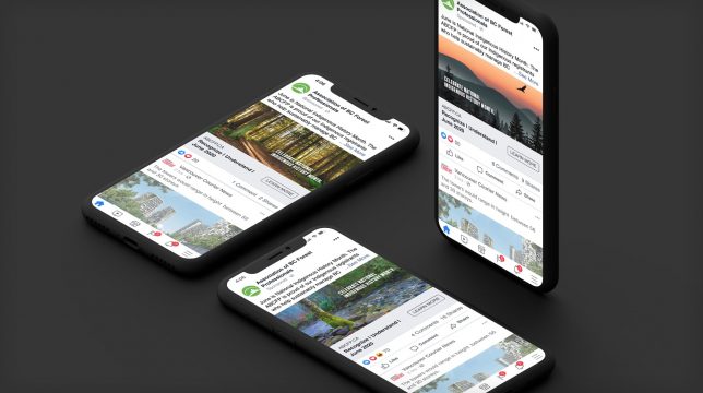
- Facebook Ad Campaign
- Brochures and Pamphlets
- Newspaper
- Multicultural Advertising
- Art Direction / Custom Photoshoot
The Challenge:
Rebranding for successful political organizations is historically risky, and the idea of change is often responded to with hesitance and caution. Current responsive design perspective requires seamless integration for both the logo and content, to retain fluidity, and have the ability to integrate cross-platform. Vision’s goal was to ensure citizen confidence by providing continuity, functionality, and ultimately, engagement.
The Strategy:
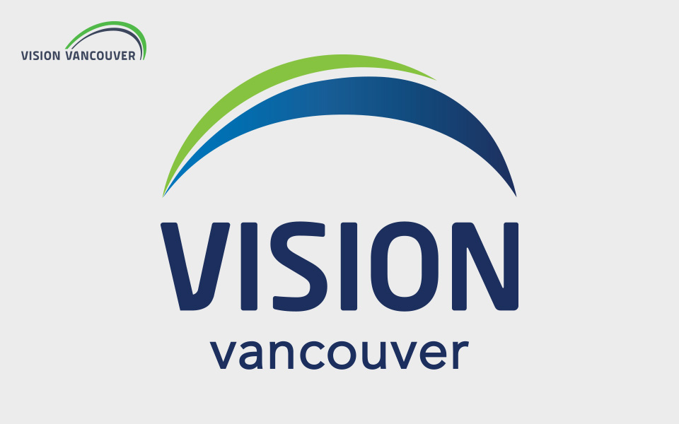
The circular logo highlights the party’s inclusivity, and the optics gear towards an overall goal-oriented, forward-thinking political party. We reformatted the logo for usability, ensuring platform-neutral capability, especially since the logo needed to appeal to the diverse voter base, including some versions involving Chinese characters.
We used a similar colour palette to that of familiar Vancouver organizations to ensure a seamless, cohesive “Vancouverite” identity. The strategy for the overall social optics of the campaign was to use candid photos, to give a more authentic feel. The brand’s essence evoked a fun, inclusive, active and healthy city. KIMBO Design adapted it for all online channels, and kept a balance with applications. We wanted a multi-purpose and easily navigable website reflecting the user’s expectations on engagement. The brand projects a bright, optimistic and enhanced image, matching that of Vision’s outlook goals.
Results
The designs came together cohesively, and spoke to their key influencers and adapters. The Vision Vancouver campaign encompassed the entire package: social media, branding, and content tone. Rebranding using culturally-inclusive themes immensely impacted the voter base, and led to the highest municipal election voter turnout in Vancouver since 2002. The brand positioning achieved by KIMBO Design shone through in this campaign, and supported a convincing win.